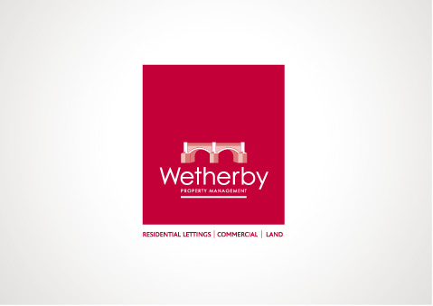
The images below demonstrate three routes that were created for Wetherby Property Management.
The brief was to create designs that referenced Wetherby Bridge a landmark well known to the people of Wetherby.
Red was used to contrast with the competitors predominant use of blues and greens.
Route one was a stylised illustration of the bridge.
The second route echoed the arches of the bridge in a split branding system across the three main business activities.
The final and selected route moved away from the literal depiction, with the name Wetherby being looped by an arch of the bridge.
Miss S A E Eldred
Director
Wetherby Property Management Ltd